A Modular Framework for Multi‑domain Design Integrity
Standardizing interface components and interaction patterns across distributed teams while embedding accessibility, brand flexibility, and parity into the scalable Fieldhouse Design System.
Introduction
When I joined LeagueApps, the company had grown to serve more than 2,800 youth sports organizations, each with its own unique brand identity, audience, and culture. The platform's original theming system evolved over years of one-off partner requests and design exceptions. As a result, it became overly customized, unstable, and inaccessible.
The design system initiative began as a modernization effort to rebuild our visual foundation from the ground up. Our mission: create a scalable, accessible, and brand-flexible system across two themes — a member portal theme that empowered partners to express their identity, and a management console theme that maintained the clarity, consistency, and trust of the LeagueApps brand for administrative experiences.
As the Senior Product Designer, I led this transformation from concept to implementation, collaborating with design, engineering, and customer success teams to establish an enduring design foundation for all future LeagueApps products.
I named our system "The Fieldhouse."
The Fieldhouse — Why the name
A fieldhouse is the central structure of a sports complex. It's where teams train, compete, and gather. It's the infrastructure that makes every game possible — providing the rules of the court, the markings of the field, the lighting, the safety standards, and the equipment teams need to perform their best, regardless of the sport they play.
Likewise, the Fieldhouse Design System is the infrastructure for product design at LeagueApps. It provides the foundation — patterns, components, and principles — that every product team can rely on to create consistent, accessible, and scalable experiences. Every LeagueApps partner brings their own brand and culture to a shared platform; the Fieldhouse ensures they can all play their unique "game" without breaking the rules that keep the experience fair, safe, and unified.
Context
LeagueApps serves a uniquely fragmented audience — youth sports organizers, parents, players, and coaches — each interacting with the platform through different branded portals. This made consistency both essential and uniquely challenging.
The management console, used solely by partner organization administrators, was branded entirely as a LeagueApps product. Partners, however, desired control over brand expression within their member-facing experiences. But too much flexibility bred chaos.
- Some programs displayed poor color contrast
- Others used mismatched typography
- Many completely obscured the LeagueApps brand
- In user testing, parents often didn't realize they were using LeagueApps at all
Theme 1
Member Portal
Partner-controlled brand expression — colors, typography, identity. Designed to flex across thousands of organizations without breaking accessibility or usability.
Theme 2
Management Console
LeagueApps-branded administrative experience — clarity, trust, and consistency maintained for all org admins and staff regardless of partner.
Internally, the design system team faced additional pressure. The organization underwent a reduction in force midway through the rebuild, leaving maintenance and governance at risk. What began as a design system overhaul evolved into a cross-functional effort to stabilize the platform, protect accessibility, and future-proof design operations.
Problem
Core Tension
How do we reclaim brand integrity and enforce accessibility standards without stripping away the partner customization that makes the platform valuable?
The existing theming system enabled unsustainable customization. It created four compounding problems:
- Inconsistent visual experiences — across partner sites, no two looked or behaved alike
- Accessibility failures — particularly color contrast and readability, across both admin-facing and member-facing systems
- Performance issues — engineering teams had to account for thousands of edge cases introduced by unconstrained theming
- Brand confusion — LeagueApps' identity was diluted or invisible in most partner contexts
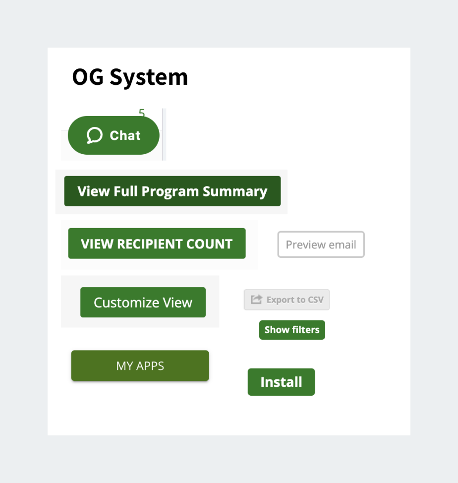
The original system — far too many button styles, no coherent hierarchy.
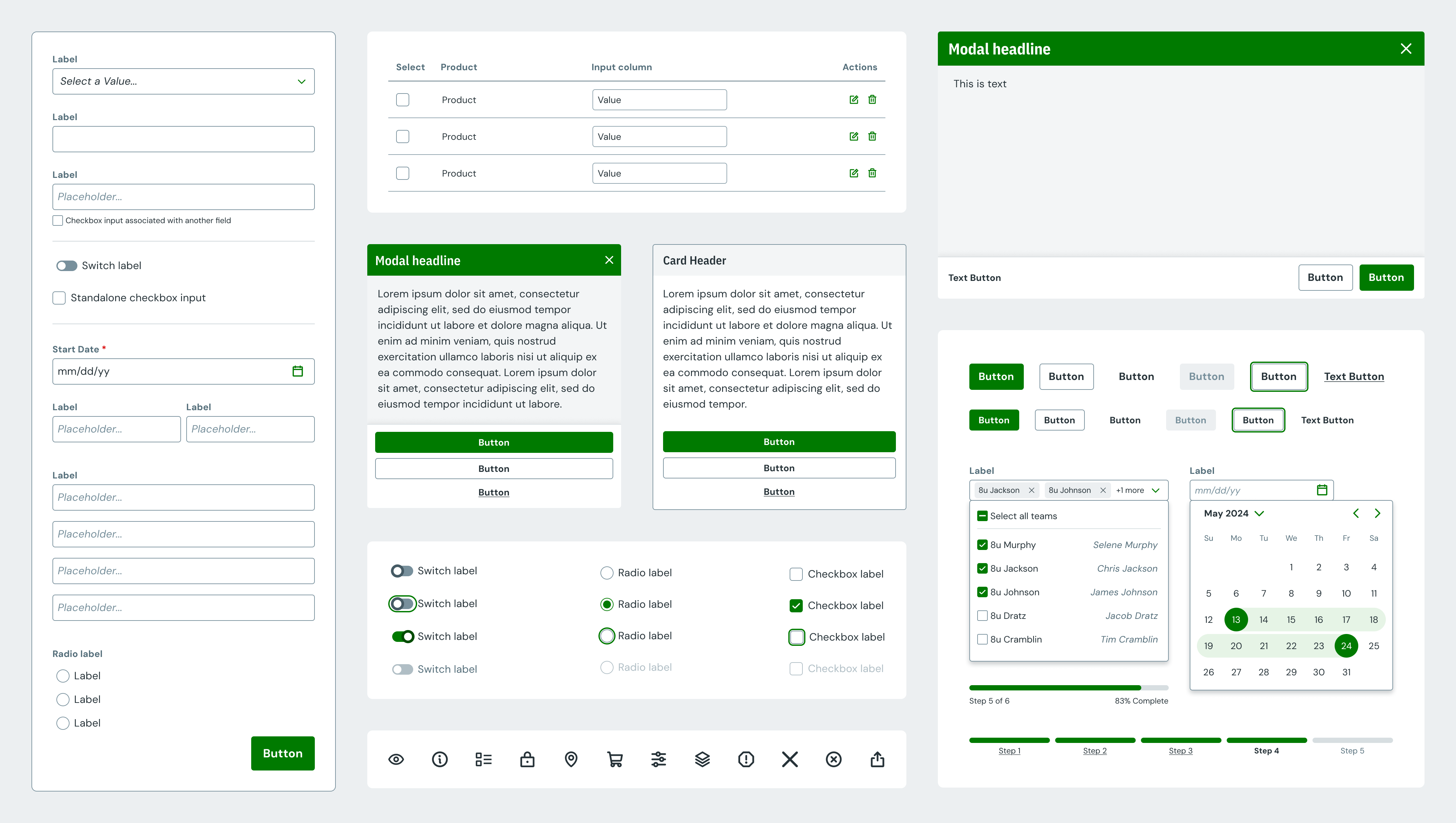
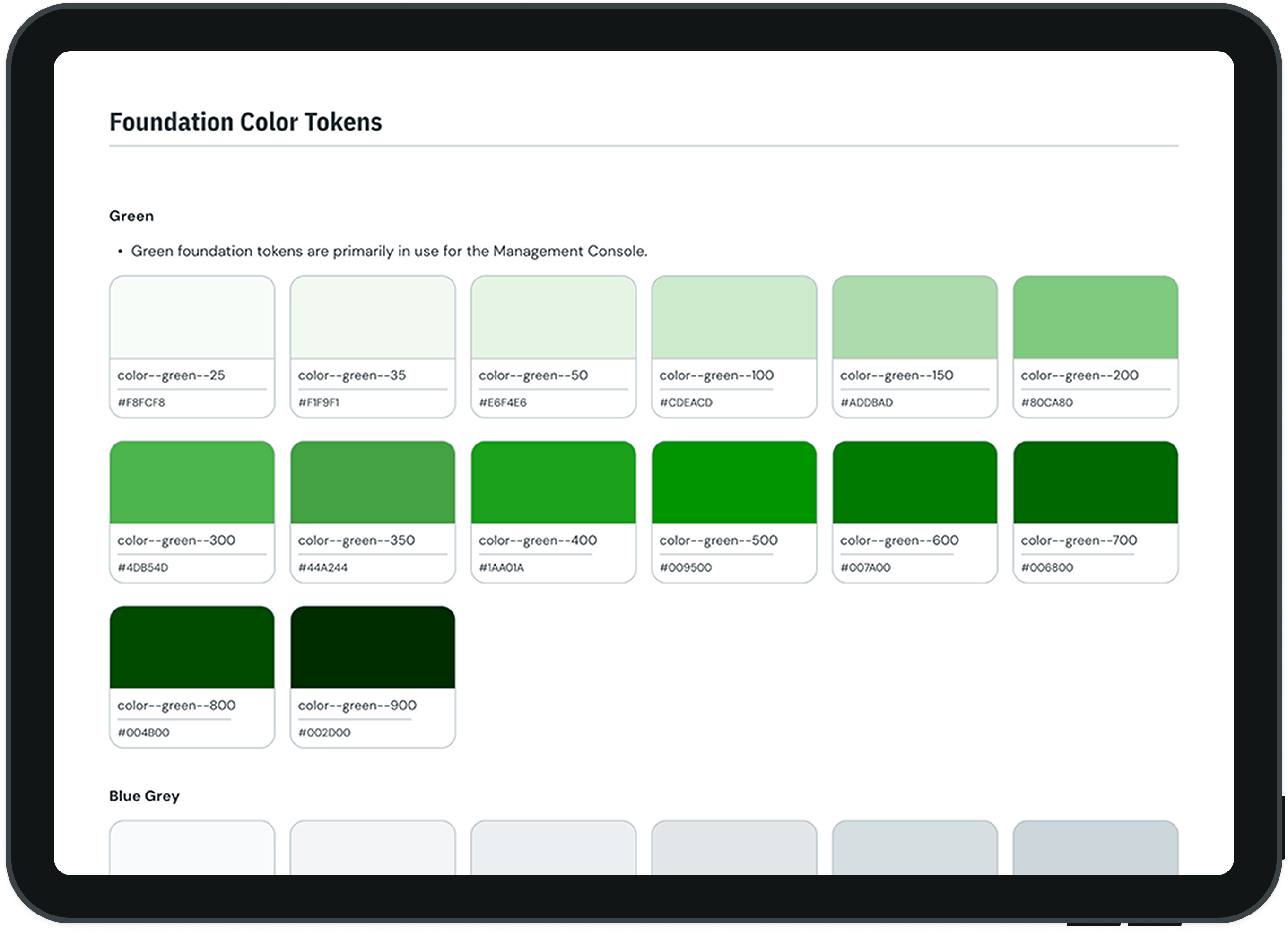
After 6 months: 12 priority components redesigned and systematized.
Process
Data-Driven Prioritization
I collaborated with product and engineering to audit every customization in use across the platform. Partnering with customer success and support, we analyzed which customizations truly mattered to users versus those that introduced risk. This identified redundant options we could sunset, standardize, or reimagine for scalability.
Internal Empathy Building
I ran internal focus groups with customer-facing teams to understand the pressures partners faced — sponsorship demands, brand loyalty, and local recognition. These insights ensured the redesign protected accessibility while preserving partner trust.
External Research & Competitive Benchmarking
Qualitative research with both organizers and members surfaced a key tension: organizers valued strong brand presence and customization, while members prioritized clarity, legibility, and trust.
I also audited theming models from major e-commerce platforms — Shopify, Squarespace, and Etsy — studying how they handled color systems, accessibility defaults, and brand flexibility at scale. Shopify's logic-driven color framework became our north star.
Solving the Color Problem
The most complex design challenge was color. Sports organizations often use red as a brand color — which conflicted with our system's red error states and failed WCAG contrast requirements.
To solve this, I introduced a neutral base theme for UI components. Partner-selected brand colors were then layered on top strategically, ensuring sufficient contrast and brand expression without sacrificing usability.
We implemented a two-color theming system: partners defined a primary and secondary color, while the system dynamically generated accessible shades and tints based on luminosity. Every experience became compliant by default — without requiring users to understand accessibility guidelines.
Cool primary (blue)
Warm primary (red — common in sports)
Shades and tints are generated dynamically from luminosity logic, keeping interactive and error states accessible regardless of partner brand color.
The color generation logic that powers accessible partner theming across all Fieldhouse components.
Rebuilding Governance After Reduction in Force
After a reduction in the design system team, I partnered with our engineering lead to establish a lean governance model for ongoing maintenance. We restructured the ticket triaging process, documentation, and prioritization to enable a democratized and sustainable system evolution — avoiding bottlenecks or single-contributor dependencies.
The lean governance model established after the team reduction — built to keep the system moving without a dedicated design systems team.
Implementation & Rollout
The MVP for the new Fieldhouse system included dynamic two-color theming with accessible shade logic, WCAG 2.1 AA–compliant components across both themes, and a new theme editor that balanced flexibility with platform stability.
We sunset the legacy editor, rolled out Fieldhouse across all three LeagueApps product environments, and reintroduced the LeagueApps brand identity across partner portals.
Outcome
Accessibility compliance documented for all components across both the member portal and management console themes.
The Fieldhouse Design System brought clarity, trust, and inclusivity to every layer of the platform:
- Accessibility by default — all core components met WCAG 2.1 AA standards without requiring partners to understand accessibility guidelines
- Brand coherence restored — partner sites now reflect both their identity and the LeagueApps brand with balance and consistency
- Improved developer velocity — centralized, well-documented components reduced maintenance burden and eliminated recurring design debt
- Foundation for future work — Fieldhouse supported the new Next-Gen Tournament Platform, Team Builder, and all subsequent major initiatives
Design systems have allowed me to focus on the task at hand rather than worrying about styling and contrast. It's consistent, visible, and intuitive.
— LeagueApps Front-end EngineerReflection
What I'd Do Earlier
- Introduce automated accessibility testing from the start
- Build partner education into the rollout, not as an afterthought
- Establish governance structure before team reduction forced the issue
What This Project Reinforced
- A design system's success is measured by trust, not pixel perfection
- Governance is a design problem, not just an ops problem
- Constraints can be features — accessibility guardrails felt like empowerment to partners
Org Resilience Lessons
- Design systems must survive personnel changes — document accordingly
- Democratized contribution beats single-contributor heroics
- Lean governance is better than perfect governance that never ships
Long-term Impact
- Fieldhouse became the design foundation for all future LeagueApps products
- The governance model outlasted the team that created it
- Partner trust in the system reduced support volume over time
Fieldhouse succeeded in what mattered most — it balanced customization and control, creating a platform that was flexible for 2,800+ customers and accessible to everyone who used it.